The charts show the distribution of money spent on music in three different years in Northern Ireland. Summarise the information by selecting and reporting the main features and make comparisons where relevant.
Sample 1:- The Charts Show the Distribution of Money Spent on Music
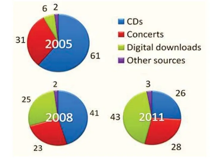
The pie charts illustrate the expenditure on music sources like CDs, concerts, digital downloads, and other music sources in 2005, 2008, and 2011 year in northern Ireland.
From an overall perspective, it is readily apparent that most of the money was spent on CDs earlier, but digital downloads outraced the CDs in the final year. The use of CDs decreased over time while concerts showed fluctuation and spending on digital downloads and other sources increased in the given time.
Spending on CDs was the maximum among all and more than half of the total with 61% in 2005, which declined by 20% in 2008, and then 15% in 2011, accounted 26%. However, concert expenditure fluctuated at 31% in 2005, reduced to 23% in 2008, and then again increased by 5% in 2011, witnessing 28 %.
As technology became advanced, people started downloading songs, and then spending also increased on this from a mere 6% in 2005 to almost a quarter in 2008 (25%) and became the most used source in 2011, with slightly less than half of the total sources as 43% in Northern Ireland. Besides these listed sources, many other sources also need money, as 2% in 2005, which remained the same in 3 years and changed by only 1% in 2011, stood at 3%.
Sample 2:-The Charts Show the Distribution of Money Spent on Music.
The given by graphs illustrate information about penny distribution on music in three different years for products.
Overall, it is apparent from the very first glance that digital downloads were the lowest in the beginning, but they escalated in a test over the years. In contrary, CDs decreased over the year.
Looking at the information in more detail, in 2005, 61% of cities were boats, and in 2008, it decreased by around 20%, and in 2011, only 26% of the money was spent on it. On the other hand, it went up and became four times more in 2008 and 7 times in 2011.
Moreover, concerts show fluctuation like 31% in 1st year, kuchh down around 9% in the second and rest of the year inclining almost 6%. Furthermore, in 2005 and 2008, Northern Ireland contributed two people to other resources; in 2011, it increased by one percent and then student 3% respectively.
Sample 3: The Charts Show the Distribution of Money Spent on Music
The pie charts illustrate the percentage of money expenditure on four types of music, namely CDS, concerts, digital downloads, and other sources, in the year 2005, 2008, and 2011 in Northern Ireland.
Overall, it can be seen that CDS was popular at the beginning time, while digital downloads surpassed the CDS format at the end of the time period.
To begin with, in 2005, the majority of Northern Ireland people spent money on CDS, which was above three-fifths, while half of this money was spent on concerts by people. In addition, people who bought digital download music and other sources were a minority, which was 6% and 2%, respectively. After three years, around 23% and 25% of money expenditure on music concerts and digital downloads by Northern people. Moreover, about 25% of the money was spent on CDs, and 2% was spent on other sources.
Apart from this, changes were seen in other sources of music and concerts in 2011, which was 28% and 3%, respectively. The CDS music format faced all-time low levels of money expenditure, which was only 26% in 2011. From the end of the period, the highest amount of money spent on digital downloads was almost two-fifths.


Leave a Reply