The graph shows the average annual expenditure on cell phones and residential phone services. Summarize the information by selecting and reporting the main features, and make comparisons where relevant.
 Sample 1 The Graph Shows the Average Annual Expenditure on Cell Phones
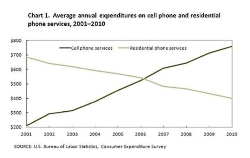
The stimulated line graph illustrates the average yearly money spent on cell phones and residential phone service between 2001 and 2010
After analyzing, it can be seen that in 2001, the money spent on cell phones was nearly 300 dollars. From 2002 to 2003, there was a nominal increase in cell phone services. The funds disbursed on the cell phone service increased sharply throughout the period, exceeding resident al phones services in 2006 and reaching almost 600 dollars in 2007. During 2008 – 2010 it experienced a rapid surge to more than 700 dollars and continued with a gradual increase to around 800 dollars in 2010.
Turning to the rest of the description, in early 2001, phone services the expenditure on residential phone service was at least 700 dollars. However, it dramatically declined to 500 Dollars in 2007. From 2008 to 2010, it decreased rapidly throughout the period.
Overall, the money spent on cell phone services showed an upward trend, while money consumed on residential phone services showed a downward trend.
Also, Read The Table Below Gives Information on The Proportion of Carbohydrates
Sample 2 The Graph Shows the Average Annual Expenditure on Cell Phones
The graph illustrates the yearly expenditure on cell phones and residential services between 2001 and 2010.
Generally, cell phone services showed an upward trajectory from the beginning to the end of the period, while residential phone services depicted a downward trend throughout the period.
The Cell phone services from 2001 to 2003 showed a gradual rise in expenditure from $200 to about $330. This trend started surging significantly from 2003 to 2007, with total spending of around $650; towards the end of the period, the trajectory had shown an approximated annual growth of expenditure of about $750 by 2010.
On the other hand, residential phone services depicted the total opposite compared to cell phone services. Firstly, from 2001 the total expenditure was roughly about $690, $490 more in comparison to the cell phone in that particular year. The trend plummeted suddenly, hitting a low point of approximately $540 between 2006 and 2007. This graph continues to show that this trend kept dropping all the way drastically throughout the period making a total expenditure of about $430 by 2010.
Leave a Reply